Triple P Online
UX/UI webdesign
About the project
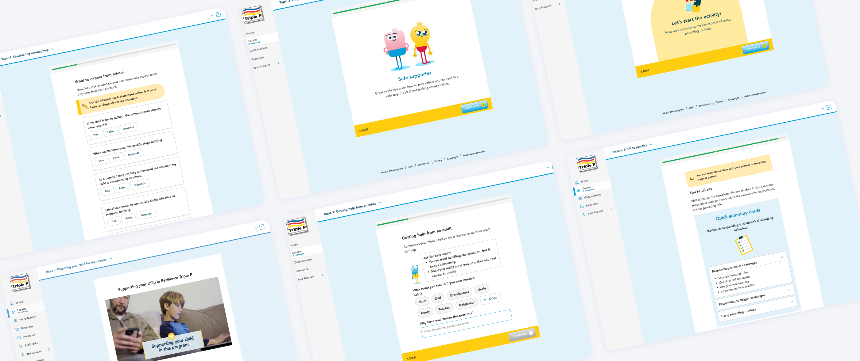
The digital Resilience Program needed to feel approachable, supportive, and easy to navigate, without distracting from the learning content. To achieve this, we developed a cohesive visual language: soft, friendly colors, clear typography, and consistent UI patterns guide parents through each module.
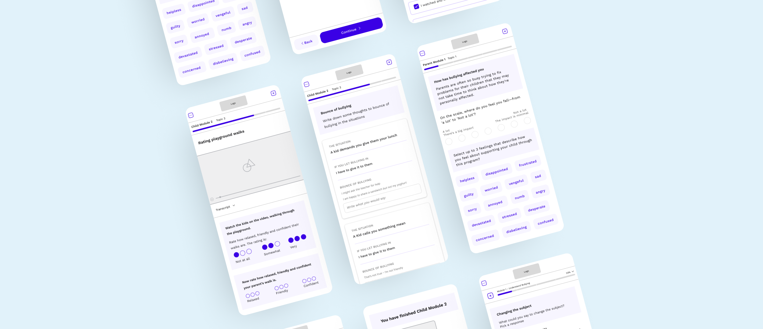
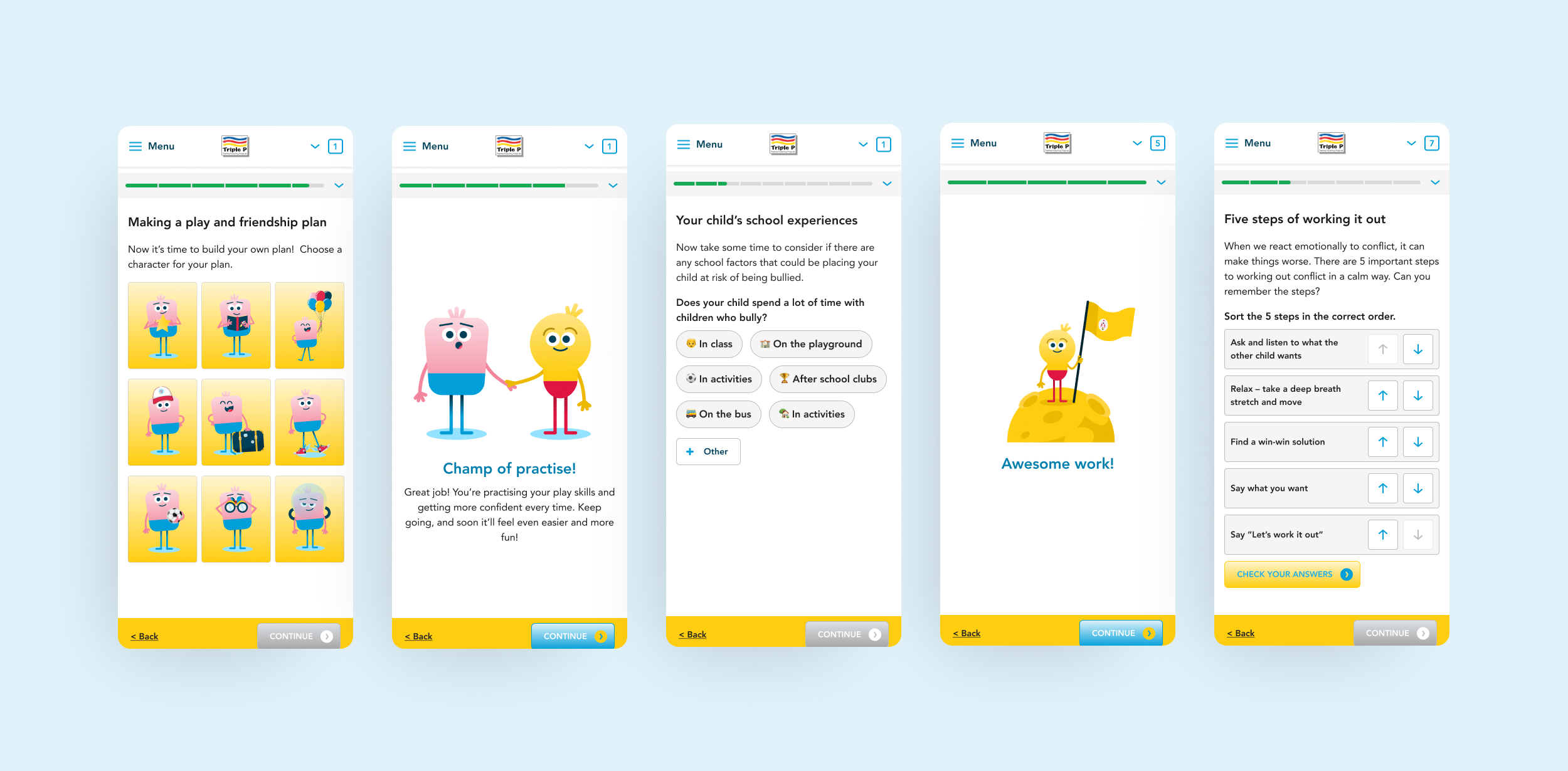
In the child-focused environment, we used characters to create a playful and engaging space. Meanwhile, the parent environment used the characters’ hands interacting with objects to provide subtle references, but they were never the main focus.
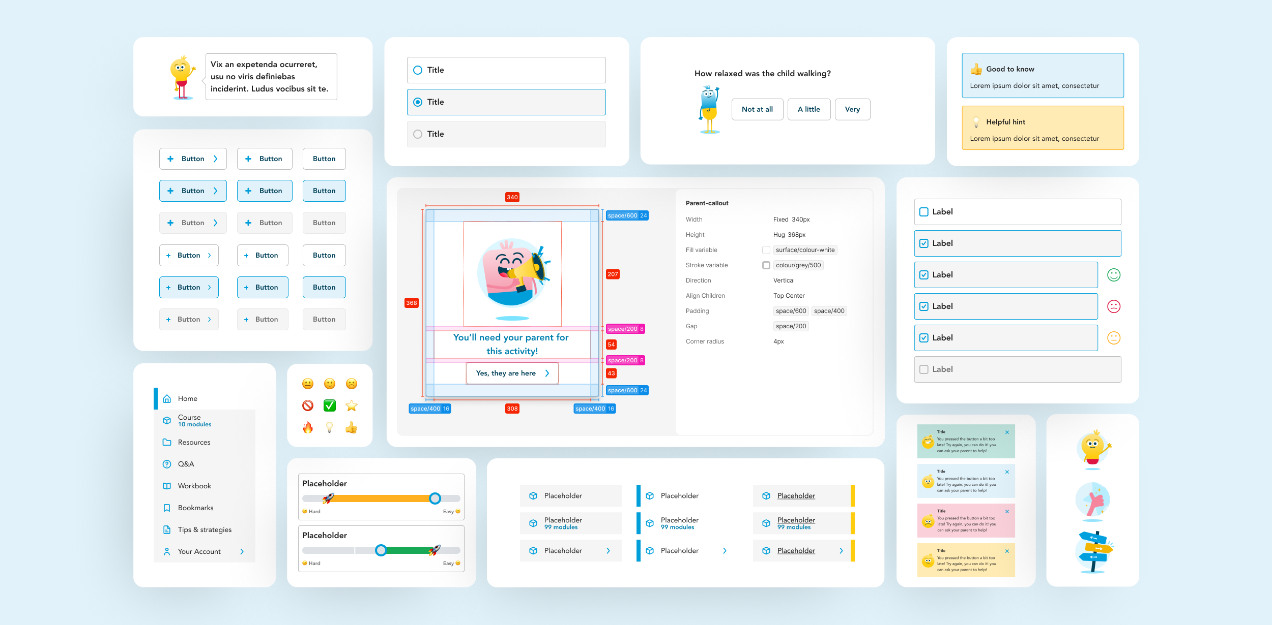
Interactions were designed to feel intuitive and encouraging. Buttons, toast notifications, progress indicators, and microinteractions provide subtle feedback, reassuring users as they complete exercises or reflect on content. White space and modular layouts reduce cognitive load, making dense information feel digestible.
Every visual and interaction choice was grounded in empathy: from calming color tones to approachable iconography, the design creates an environment where parents and children can learn confidently, engage meaningfully, and focus on applying strategies rather than navigating the interface.
My share
- Creative concept and narration
- Development of the character, writing script and art direction of the motion design
- Desing system and UI-kit development
- User interface design, translate brand experience and optimize UX
- Apply WCAG guidelines
- Illustration of the characters
About the client
Resilience Online is a parenting program developed by Triple P to support parents and children affected by bullying. The goal of the UX/UI project was to design the digital platform that helps families build emotional resilience, improve communication, and access evidence-based tools in a safe and supportive environment. The platform complements the existing Triple P framework by making resources more accessible, structured, and emotionally sensitive.
Client:
Triple P Online
Category:
UX/UI, storytelling, webdesign, digital design
Date:
2026
On behalf:
Bureau Blanco